23.3 Task 1 bar chart
 https://howtodoielts.com/wp-content/uploads/2022/06/7-1-2022-4-27-03-AM-compressed.jpg
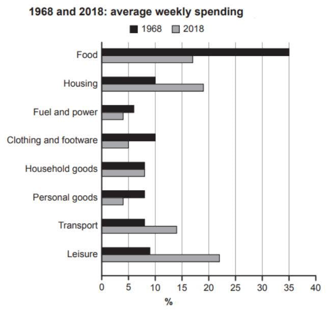
The bar chart compares the ratio of average expentidure in any given week on different eight areas in years 1968 and 2018.
Overall, housing, transport and leisure followed an increasing trend, while food, fuel and power and personal goods experienced a decreasing trend. The spending on household goods reamined unchanged in both years. The maximum increase in ratio was seen by leisure, whereas the maximum decrease by food.
The percentage for food, clothing and footware and personal goods sharply declined to around half of their original value to 17%, 5% and 4% respectively in year 2018. Fuel and power declined by nealy 50% from its intial value to end at around 4%. Household goods were constantly close to around 8% in both years.
Housing's ratio was nealy one tenth in first year, which advanced almost double to end at slightly lower than 20% in the final year. Transport also nearly doubled from its original values to reach at 14% eventually. An increase of 13% was seen by leisure in the 40 years.
-=-=-=-=
expentidure = expenditure
reamined = remained
nealy = nearly
intial = initial
Comments
Post a Comment